Price Chart
The Price Chart shows the historical Price movement of the Underlying - and its possible future movement as a Probability Cone to the right. However, the Price Chart is more than that due to its ability to show price movement data in a highly configurable, user-specific way - and in the process it becomes a very powerful trading tool in its own right.
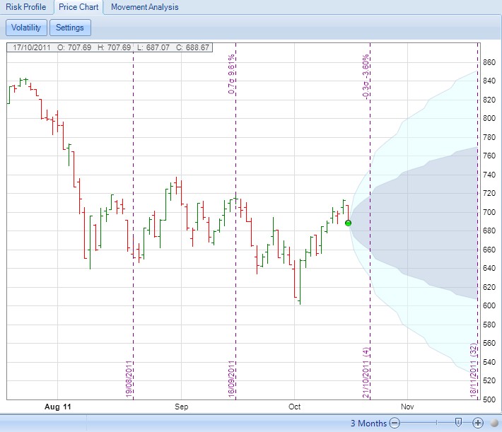
The default Price Chart will look something like the following for Underlying "RUT" in period August 2011 to November 2011:

Some Features of the Price Chart
Note the zoom in and out control on the bottom of the Price Chart that allows the date range being displayed to be changed.
The green circle on the Price Chart represents a trade or adjustment point, places where you have committed an opening or adjusting trade for the selected Open Position. In the example above, there is a single green circle where the Position was opened. You will see a green circle plotted on the Price Chart for every subsequent adjustment made.
Although not shown in the Price Chart above, the current underlying price and most recent adjustment point are joined by a dashed-line to make it easy to visually determine the direction of movement (up/down) between the two points (since the last adjustment was made). This could help to determine if further adjustments are necessary.
You can change the Trading Date by pointing your cursor to a specific bar/candle on the Price Chart and left clicking with your mouse.
Also note the vertical lines - these show option Expiration dates with Standard Deviation and percentage change moves between dates labelled at the top. The actual dates are labelled at the bottom with number of days to Expiration in brackets for future Expiration dates.
Hovering the mouse above one of the price bars will display further details about that individual bar, as in the following example detailing the date, open, high, low and the official closing price of the Underlying:

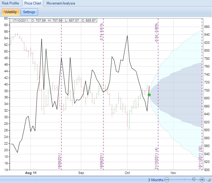
Clicking on the "Volatility" button on the top left hand corner of the chart will overlay the Price Chart with the corresponding Implied Volatility graph, as shown in the following example:

Also note that the "Probability Cone" - that is, the possible future price movement shown as a cone (with dark blue representing a one Standard Deviation move and light blue representing two Standard Deviations) - can be configured by right clicking the mouse anywhere on the chart. The resulting parameters will be displayed:

Note the "Set Probability Cone to THIS DATE" option is only available when hovering over a specific bar/candle and right clicking the mouse.
These parameters can be used to determine where the Probability Cone is to be plotted from:
•the first trade you have made (when you opened the position).
•the most recent trade or adjustment.
•the current bar/candle (only available when hovering directly over a specific bar/candle when you right click the mouse).
•the "Off" value disables the Probability Cone.
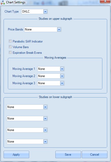
Clicking on the "Settings" button on the top left hand corner of the chart will display the following window:

There are a great number of possible parameters detailed in the Chart Settings window. In summary we can describe these parameters as follows:
Parameters available on the Price Chart Settings |
|
Parameter |
Description |
Chart Type |
The basic type of chart: "Candlestick" - see: http://en.wikipedia.org/wiki/Candlestick_chart "OHLC" - Open-High Close-Low see: http://en.wikipedia.org/wiki/OHLC |
Studies on Upper subgraph |
|
Price Bands |
One of: "None" - Do not display any price bands "Bollinger Band" - see: http://en.wikipedia.org/wiki/Bollinger_Bands "Donchain Channel" - see: http://en.wikipedia.org/wiki/Donchain_channel "Envelop" |
Parabolic SAR Indicator |
If selected, you are then prompted for an "Increment" and "Maximum". |
Volume Bars |
Show bars of trading volume for the Underlying. |
Expiration Break Evens |
Show the Break Evens for the Open Position plotted as horizontal lines on the Price Chart. |
Moving Averages |
|
Moving Average 1, 2 & 3 |
One of: "Simple" - see: http://en.wikipedia.org/wiki/Moving_average "Exponential" - see: http://en.wikipedia.org/wiki/Exponential_moving_average "Triangular" "Weighed" - see: http://en.wikipedia.org/wiki/Moving_average#Weighted_moving_average |
Studies on lower subgraph |
|
Study 1, 2, 3 & 4 |
One of 35 technical studies. |
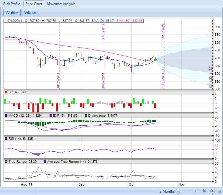
Finally, here is an example of a configured Price Chart - note that additional studies and subgraphs have been added into the Price Chart, but that all share the same time span running across from left to right on the bottom line:
